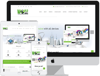
Responsive Web Design (RWD) is a process of designing websites to work with minimum re-sizing, panning, or scrolling to get the information you want on all devices that you may use.
What device do you use most to search the web? Well if you are like most people today, you probably use your mobile phone. Now that most companies have mobile friendly websites, it is easy to get the information that you need on the go. When you search for a movie or restaurant on your cell phone, you will find a variety for sites that have what you are looking for. Did it ever occur to you that these websites are now designed to work across all platforms, that’s right they have been designed to work on your desktop, laptop, tablet, mobile phone, and Smart TVs.
If you are looking to have a new website designed, make sure that you think about what your audience will be using to access your information. You will need to tailor your design to your client’s devices, and make sure that they can get your information on whatever device they decide to use.
Worldsubmits.com makes sure that all websites we build will work on all your devices, so your customers will have the same experience on their desktop, laptop, tablet, mobile phone, or Smart TVs. Simply put our Web Developers do the extra design research to make sure that you customers have a great experience when they search your website on all their devices. You will have more conversions when you have happy customers.
by: Willie Diggins